Thursday, 30 December 2010

Logos and The First Website Design

I have been working on the logo's and images that I want to use for the websites, 


Here is the header/title of the page. I really like it. It fits the tattoo idea, and with his being a faded tan colour, it should work well with the the back ground image. 

I kept the image 3x4 squares in the top right of the picture. So it would fit great. I prefer this image title to the header. Which leads me on to something else....

Instead of having a navigation bar, I thought I would attempt to keep the website simple. This will allow to create any additional features which could improve it, for example, an interactive slide show for photographs.

With this minimalistic idea, the navigation will be worked out and displayed after the explanation of the creation of the navigation buttons which will allow the user to click on their desired destination.  So I scanned in some ideas from my sketch book, re-drew them in Photoshop and applied them on the the website.


For example, this nautical star was traced by me, but I applied lines this lines onto it, which even though it does make it look shabby, it looks better with colours..
I have kept this image to design ideas/colours, even though they may clash with the back ground image. 

The next thing i wanted to do was to add a tattoo style banner across the bottom of the image, to show the title of the button/link. 
and there we go... With using the warp tool, I am able to manipulate the text so it will flow with the banner. 

Here are a few more I made, 


For the pin up style ladies, I have stayed with the idea of having them to the style of Jame Hernandez, by only using black and white. It was hard to keep the outline flowing when I traced over it. But because the image will be small,I don't think it will be noticeable. I like it !!

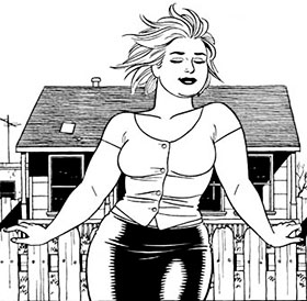
I'm sorry about the low quality image. I tried to make this image similar to the other pin-up girl one. But unfortunately, it was difficult to trace over it. But it will still be good. I think may have to cut her legs off though because her legs may get in the way.

here is the swallow tattoo idea. Similarly to the star, the main colours are Blue and Green, for the Lincolnshire Flag. 

All these images will be links, to link the user onto another page. That will be completed in photoshop.

I just have to align the buttons up on the back ground.


I don't really know which one i prefer. But I think I'm going to stick with the icons on the bottom of the page like this...


The band have a few songs on sound cloud, so I think I might put the song in the footer, so the song should automatically play when the website is activated. 


For more logos and images see sketch book

-------------------------------------------------------------------------------------------------------------


Monday, 27 December 2010

Album Covers Idea

This is just a quick idea, about creating an album cover as a design idea for web page.

one idea is adapted by using the Beatles Let it be, album cover,


I have adapted it, by using the style of the images of the 4 members of the band, by adding Midnight High in it.  This should be a good background for the website. Here's a brief draft example, 


Here is another example, 


Unfortunatly, there are no clear images of the guys facing forward clearly, without having different effects of the images or the resolutions varying. The best image I can come up with now (which isn't fantastic) is this one.

 
Still keeping with the Americana theme as the back ground. This is only a quick 5 minute test, I'm going to go out and take pictures of them all together to get better images. 


Here is the famous album from the Clash. I like the idea of the vertical and horizontal text, with the main image of the guitar being smashed. I want to create something similar to this iconic image. 

The text needs changing, but overall, i like this image. 


Now i'm going to attempt to place a header and a content box on these designs. to see how they would suit as website backgrounds. 


Using the idea , I have used this back ground with having orange transparent blocks to represent the header and content boxes. I like it. It would be brilliant is I could include more colours for the context box. For example, still having it transparent, but with the images in it. 


I like this idea too. Similarly having the boxes transparent the band in the background are now visible.  

I think, I might have work between the two ideas for back grounds, by adding images and content to see which one fits. 


Friday, 3 December 2010

The Fonts

This blog post is going to be dedicated to the fonts of the website.
After previewing many fonts from da font, I have came up with a sheet of 17 different fonts, all with the bands name. Out of them, I will choose 4-5 and when available edit them in photo shop/illustrator and see what I can create.


Out of the rest of those fonts, I decided to choose, these....

I chose the first one, because it reminded me of the wild west, cowboys and Indians style, and it also looks like a childish cartoon font. 

I chose the second one as well for a similar reason. It is basic, and effective. With just the outline to this font, it would be easy to add colour to it. 

I'm not too sure about the third one. I like the detail at the bottom of each letter, but my main concern is that the "M" is almost identical to the "H".

The forth and final one, I like, because like the second one, it is basic, and it has that "tattoo charm" I am looking for. I think it would be better for the title of the page instead of using it as a font in the content boxes as it could get monotonous and hard to read. 

-------------------------------------------------------------------------------------------------------------

Here are some examples of the text with a example header,

This isn't really great, but it's not bad.

I really like this design... Even though it's a draft, it could be really effective.

Nope.. don't like it at all!

This would be really good, if there was a tattoo scroll behind the letters. Without the white background, they fade into the background. 

I think I might work on the Second and Forth ideas. They just seem to work. The plain black and white idea could work really well, with the Jaime Hernandez theme. 

-------------------------------------------------------------------------------------------------------------

I tried out the fonts in the content box, but unfortunatly, they were not very ledgible . So I thought it would be better after looking at other bands websites for inspiration, to have a basic font. A basic font such as Arial, Times New Roman etc...


The Arial font is nice, but it is too thick....


I prefer the font when it is smaller instead of when it is big, 


Here is an example of 3 other fonts, (Franklin Gothic, Raavi and Viner Hand) ... I still prefer the Arial.

Arial with a contrasting colour will be amazing and it will make the writing stand out.... Black and white seem like a good choice 

Friday, 26 November 2010

Ideaaa

With this blog, I am also creating a sketch book with ideas. One of the design ideas for the website is a tattoo theme. It is easier for me to trace/draw tattoo's on paper, so then I can edit them by hand and then scan them into the computer.


It is then easy to trace around the sketch in either Illustrator or Photoshop. This example was done in Illustrator, but most of the tattoo design work was created on photoshop.


And there we go :)


Friday, 19 November 2010

NOSE ART and Jaime Hernandez

Have you ever seen the world war 2 films, where they hero's flying the aeroplane, with a cartoon pin up girl on the nose of the plane. And he always manages to save the world and get the girl? WELL The cartoon pin up girl on the nose of the plane is called 'nose art'.... here's a couple of pictures,


Which I'm trying to link this with Jaime Hernandez pictures, keeping a strict black and white theme,


And also add a vintage tattoo design...


FUN!!

Check the sketch book for updates and ideas.

Vector this, vector that.

After a conversation with some of the band members, we agreed on a few ideas that they seemed happy with the webpage. They have talked among themselves and decided they really wanted to either have,
  • An Americana theme, keeping with the style the images have been taken here . They would like a vector style theme of their images combined together with a similar effect on each. Also having a 1950's diner and rock 'n' roll theme. 
  • After accidental sending them the blog from last year instead of this one, they really liked the old school tattoo pin up girl/vintage tattoo.The I accentually sent them was this one... http://mattnasher.blogspot.com/
See sketch book for the random tattoo designs. On this blog I'm going to keep all the computer visuals I want to use and stuff that I have edited.


Here's some images that I have used in illustrator.


Vector is....

Saturday, 6 November 2010

How does this look?

I want to keep the design of the website simple, and the colours similar to the styles of the pictures that I have. For experimental purposes I have copied the content box layout of the Mumford and Sons website and went from there.


I used this image of the bad and cut the top and bottom off it and then used it as an experimental header, 


I really liked the idea of having the "content" box broken down into 3-4 boxes, so I applied that to the design of my website.


For the Background, I went on google images and typed in Arizona, to fit in with the style of the header, and came up with the back ground for the page.


And here is the semi finished product, keeping the colours of the boxes on the page similar to the oranges and yellows of the images.

-------------------------

I have also noticed a trend of menu bars on band websites. The most popular ones are, 
  • Home
  • Information
  • Tour Dates
  • Merchandise
  • Facebook/twitter
  • Photographs
I think I will take advantage of this and adapt the ones I think will go with the ban website.


Enjoy :)